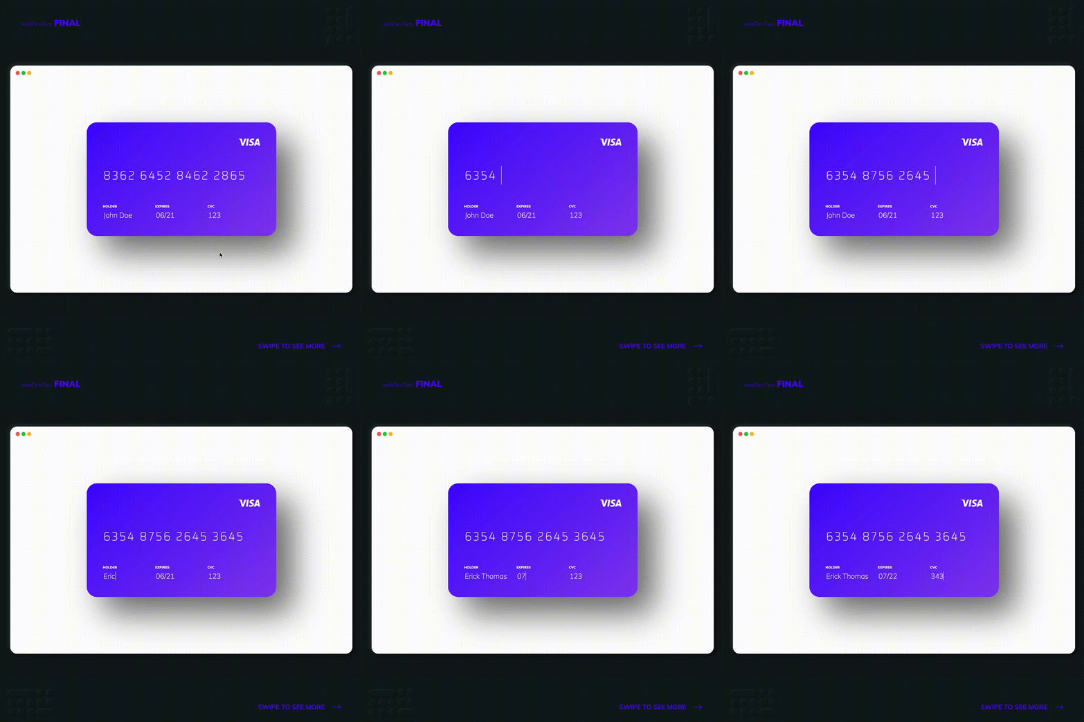
Creating a interactive Credit Card with CSS

Hey guys, what's up? 😎🤘
For today's tip we'll check how to create an interactive Credit Card with just some HTML and CSS!
This is fairly easy to do. We basically just need some inputs with labels for each of the credit card fields - number, holder, expiry date and CVC.
<div class="card">
  <img src="visa.png" class="card__visa" alt="Visa" />
  <div class="card__input card__number">
    <input
      type="text"
      value="8362 6452 8462 2865"
      onfocus="this.value=''"
      maxlength="19"
    />
  </div>

  <div class="card__flex">
    <div class="card__input">
      <label for="holder">Holder</label>
      <input type="text" value="John Doe" id="holder" onfocus="this.value=''" />
    </div>
    <div class="card__input">
      <label for="expires">Expires</label>
      <input type="text" value="06/21" id="expires" onfocus="this.value=''" />
    </div>
    <div class="card__input">
      <label for="cvc">CVC</label>
      <input
        type="number"
        value="123"
        id="cvc"
        onfocus="this.value=''"
        max="999"
      />
    </div>
  </div>
</div>
Please notice that this is a very simple example and we are not doing any data validation besides using the 'maxlength' attribute on the card number input and 'max' attribute on the CVC input. If you were to use this on an actual website for the user to enter his credit card info, you would need to validate all inputs to make sure that the card number is an actual card number, the expiry date is valid and that the CVC only has 3 digits.
.card {
  position: relative;
  display: flex;
  flex-direction: column;
  justify-content: space-between;
  width: 35rem;
  height: 21rem;
  border-radius: 30px;
  background: linear-gradient(140deg, #4605ff, #883bef);
  color: #fff;
  padding: 3rem;
}

.card:before {
  content: '';
  position: absolute;
  width: 100%;
  height: 100%;
  border-radius: 30px;
  background-color: rgba(0, 0, 0, 0.55);
  filter: blur(48px);
  z-index: -1;
}

.card__visa {
  width: 4rem;
  position: absolute;
  top: 3rem;
  right: 3rem;
}

.card__flex {
  display: flex;
  align-items: center;
}

.card__input label {
  display: block;
  text-transform: uppercase;
  font-size: 0.6rem;
  font-weight: 900;
  margin-bottom: 0.4rem;
}

.card__input input {
  display: block;
  background: transparent;
  border: none;
  color: #fff;
  font-size: 1.3rem;
  width: 100%;
  font-weight: 100;
}

.card__number {
  margin-top: 5rem;
}

.card__number input {
  font-family: 'Saira Semi Condensed', sans-serif;
  font-size: 2.2rem;
  letter-spacing: 0.3rem;
}
Everything is pretty straightforward so I won't go into much detail. We basically just need inputs for all the credit card fields. On each I have already entered a preset value and on focus we'll clear this value so the input gets empty.
Hope you liked this tip and let me know if you have any doubts! 😁✌️