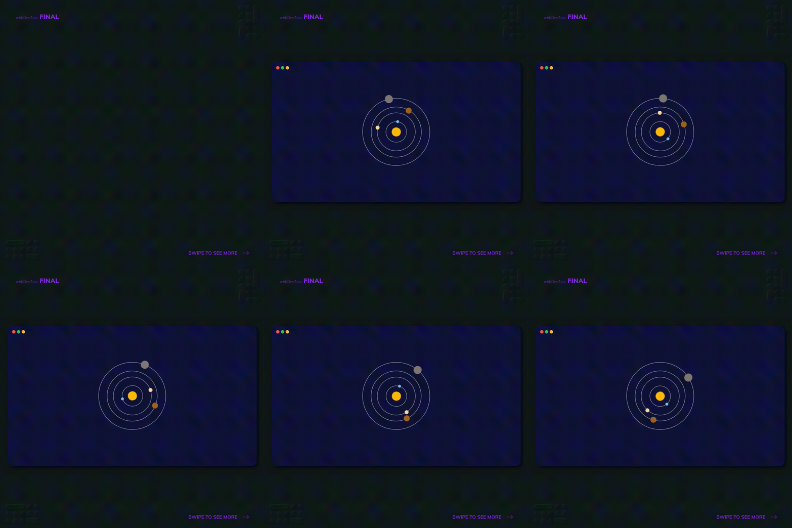
Creating a solar system orbit like animation with CSS

Hey guys, how are you? 😁✌️
So the other day I saw this really cool CSS loader that was mimicking a solar system orbit animation. I wondered how it was done and decided to try to do something similar and share it here!
Basically, in order to do this, we need to create an element with the class 'planet' for each of the orbit lines and create a pseudo element on it where we'll create the planet itself. Then, we'll create another planet element inside the last one so it will get centered and so on and so on...
<div class="solar-system">
  <div class="planet planet1">
    <div class="planet planet2">
      <div class="planet planet3">
        <div class="planet planet4">
          <div class="sun"></div>
        </div>
      </div>
    </div>
  </div>
</div>
On each 'planet' element we'll set flex display so every orbit line is centered inside the last one. We also need to add the animation to this 'planet' element where we'll make it keep rotating infinitely. We'll change the 'animation-duration' for each individual planet so they all rotate at different speeds.
.solar-system {
  width: 15rem;
  height: 15rem;
}

.planet {
  display: flex;
  align-items: center;
  justify-content: center;
  border-radius: 50%;
  border: 1px solid #dedede;
  animation-name: rotatePlanet;
  animation-timing-function: linear;
  animation-iteration-count: infinite;
  animation-duration: 15s;
}

.planet:after {
  content: '';
  border-radius: 50%;
  position: absolute;
}

.planet1 {
  width: 100%;
  height: 100%;
  animation-duration: 25s;
}

.planet1:after {
  width: 1.8rem;
  height: 1.8rem;
  top: -15px;
  background: #8a8380;
}

.planet2 {
  width: 75%;
  height: 75%;
  animation-duration: 18s;
}

.planet2:after {
  width: 1.3rem;
  height: 1.3rem;
  top: -10px;
  background: #ab711d;
}

.planet3 {
  width: 77%;
  height: 77%;
  animation-duration: 13s;
}

.planet3:after {
  width: 0.9rem;
  height: 0.9rem;
  top: -8px;
  background: #ffddab;
}

.planet4 {
  width: 55%;
  height: 55%;
  animation-duration: 9s;
}

.planet4:after {
  width: 0.6rem;
  height: 0.6rem;
  top: -6px;
  background: #82c8ff;
}

.sun {
  width: 45%;
  height: 44.5%;
  background: #ffc107;
  border-radius: 50%;
}

@keyframes rotatePlanet {
  from {
    transform: rotate(0);
  }
  to {
    transform: rotate(360deg);
  }
}
Finally, inside all the other 'planet' elements we will create an element for the sun.
And that's pretty much it! Hope you like this animation and let me know if you have any doubts 🤓🙏