Create a smooth typing effect with some basic CSS

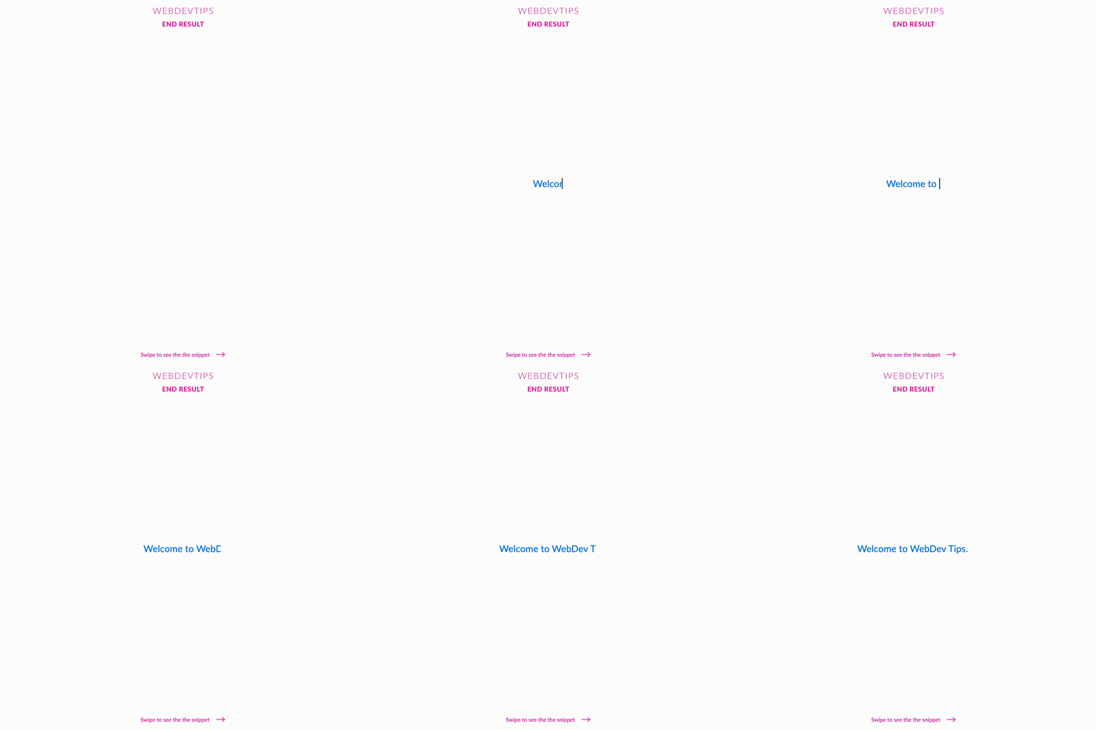
What's up guys? Today we'll take a look at how to easily create a typing effect using nothing but CSS! This is a nice animation that goes well on a intro for a website, for example, and adds a little bit of flair to your page.
We'll start by creating an element with some text inside it - in this case I used a 'p' with the class 'intro'. That's all we need in terms of HTML.
<div class="container">
   <p id="intro" class="intro">Welcome to WebDev Tips.</p>
</div>


<script>
   const loadAnim = () => document.getElementById('intro').classList.add('anim')
   setTimeout(loadAnim, 4000)
</script>
Now, on our CSS we need to set 'overflow: hidden' and 'white-space: nowrap' and give it the exact width that the text occupies. We then set a border on the right that we'll use to create the blinking bar that we see in the example. Finally we'll add two animations: one for the text and the other for the border. Notice that on the first animation we use the steps function and inside it, the first argument must be the number of characters that our text has.
Now, we need to define the keyframes for the animations we created. The first keyframes, for the text animation, will just start with 0 width and finish with the same width that we set for our element earlier. This will make the element get gradually bigger, thus showing the letters step by step.
.container{
   width: 100%;
   height: 100vh;
   display:flex;
   align-items:center;
   justify-content: center;
}

.intro{
   overflow: hidden;
   white-space: nowrap;
   font-size:1.4em;
   color:#007EFF;
   width: 265px;
   border-right:2px solid  rgba(0,0,0,.87);


}

.anim{
   animation: animIntro 3.5s steps(23 ,end),
               animBar 1s step-end infinite;
}

@keyframes animIntro {
   0%{ width:0; }
   100%{ width:265px; }
}

@keyframes animBar {
   0%, 100%{ border-color: rgba(0,0,0,0); }
   50%{ border-color: rgba(0,0,0,.87) }
}
The second keyframes, for the border, will state that in the start and in the end of the animation the border will be transparent and in the middle of the animation the border will have color. This will create the blinking effect we see on the border. Aaand that's all!